


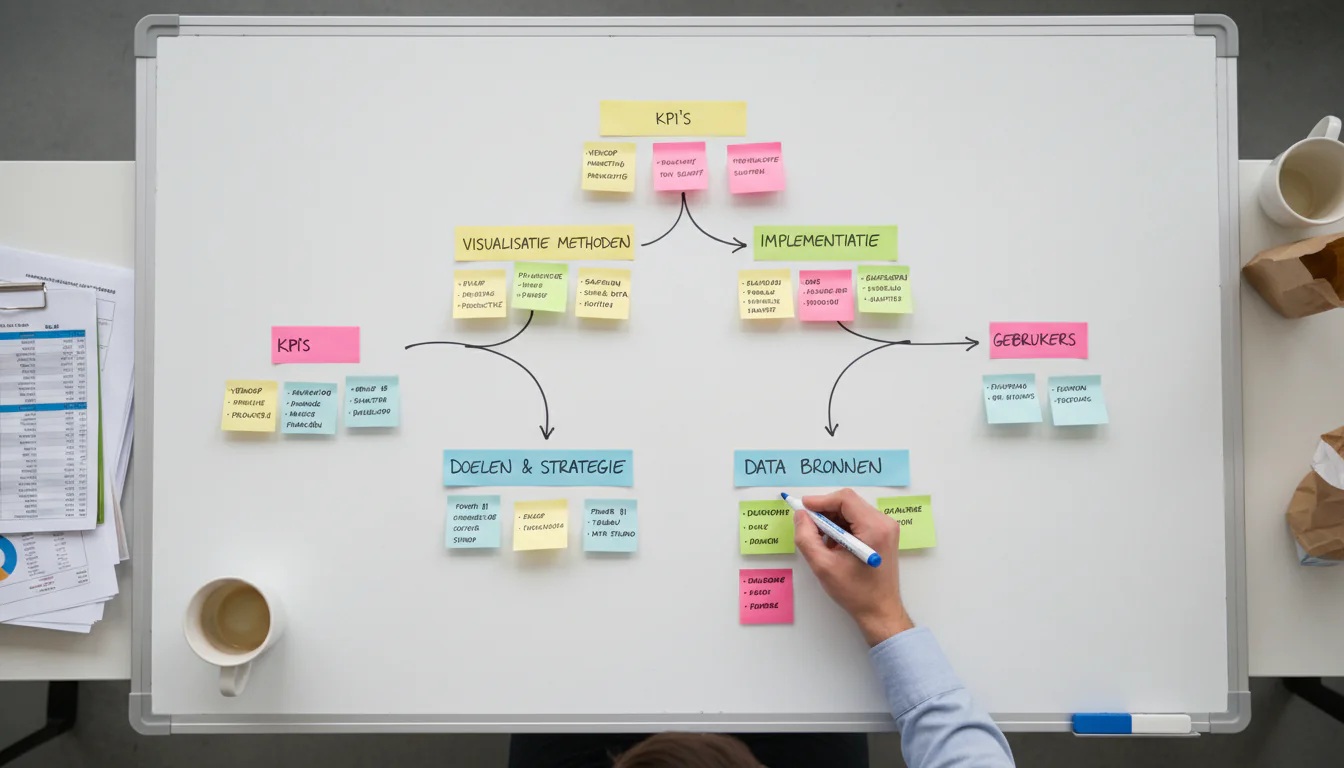
Dashboard Maken Gids: Your Complete Handbook for Dutch Mid-Market Companies in 2025
A dashboard maken gids is a structured approach to designing, building, and maintaining business dashboards that convert raw company data into decisions — not just charts. Only 20% of analytic insights ever deliver a measurable business outcome, according to Gartner. The other 80% become expensive slide decks nobody acts on. This guide covers the full picture: why most dashboards fail, how to design KPIs that drive decisions, which tools fit which company size, and how to build a data foundation that keeps your numbers trustworthy.
Table of Contents
- Why Dutch Companies Need Dashboards Now
- Why Most Dashboards Fail — and What the Exceptions Do Differently
- KPI Design in Your Dashboard Maken Gids: The Decision-Backwards Method
- Building Your Data Foundation Before You Build Anything Else
- Choosing the Right Dashboard Tool for Your Company Size
- Self-Service BI: Opportunity or Trap?
- Regulatory Context: What DORA and GDPR Mean for Your Dashboards
- From Dashboard to Decision: Making It Stick
Why Dutch Companies Need Dashboards Now
23% of Dutch companies with 10 or more employees now use AI technologies — up from 14% in 2023, a 64% jump in a single year. Yet 82% of those same employees already work with internet-connected computers daily. The gap between connectivity and actual data-driven decision-making is where most mid-market companies are losing ground to better-informed competitors.
The CBS 2025 digitalization report paints a clear picture. Financial services leads with 100% of sector employees using computers for work. Information and communication follows at 99%. Even sectors like construction and hospitality — where AI adoption sits at just 9% — are seeing pressure to modernize their reporting.
The Netherlands ranks 4th in the EU Digital Economy and Society Index for business integration of digital technology. That competitive position is built on companies that moved from gut-feel management to data-informed operations. The ones that have not made that shift yet are feeling it in margins.
McKinsey research shows data-driven organizations are 23 times more likely to acquire customers and 6 times as likely to retain them compared to peers operating without structured analytics. That is not a marginal advantage. For a €20M logistics company in Rotterdam, that difference compounds into millions annually.

Two things changed in 2025 specifically. First, AI-assisted analytics tools dropped their technical barrier dramatically — a warehouse manager in Tilburg can now build a functional sales dashboard without writing a single line of code. Second, regulatory requirements (DORA for financial services, GDPR enforcement intensifying) mean companies can no longer treat data governance as optional. Your dashboards now need audit trails.
The question is no longer whether to build dashboards. It is which dashboards, built how, serving whom. Every dashboard maken gids worth following starts with that question.
Why Most Dashboards Fail — and What the Exceptions Do Differently
Gartner estimates only 20% of analytic insights deliver actual business outcomes. The failure mode is almost always the same: dashboards built around data availability rather than decision needs. Companies visualize what they can measure, not what they need to decide.
Here is the honest part: most dashboard projects start in the wrong place. Someone in IT gets access to a BI tool, pulls the data they can reach, and builds charts that look impressive in a demo. Six months later, nobody opens the dashboard because it does not answer the questions the management team actually has on Monday morning.
The exceptions share one habit. They start with the decision, not the data.
A manufacturing company in Eindhoven with 180 employees rebuilt their operations dashboard after noticing their plant manager printed a separate Excel report every week because “the dashboard didn’t show what I need.” The fix was not technical. It was a two-hour session asking the plant manager which five decisions he makes weekly and what information he needs for each. The rebuilt dashboard took three weeks and replaced twelve separate reports.
Deloitte research finds that companies with high data maturity are 2.5 times more likely to exceed their financial targets. Only 11% of organizations reach that maturity level. The gap is not technology — it is process discipline around how data connects to decisions.
Source: Gartner, 2023
Self-service BI tools made this problem worse before they made it better. When everyone can build their own dashboard, you get “data anarchy” — multiple versions of the same metric calculated differently, causing teams to spend 20% more time reconciling numbers than acting on them. The solution is governance before tooling, always.
The 20% of implementations that succeed share three behaviors: they define KPIs before selecting tools, they assign metric ownership to specific people, and they review dashboards quarterly to remove what nobody uses. Any credible dashboard maken gids must address all three before a single chart is drawn.
KPI Design in Your Dashboard Maken Gids: The Decision-Backwards Method
The Decision-Backwards method starts with the 5–9 decisions your management team makes monthly, then works backward to identify the exact KPIs, data sources, and update frequencies required. This reverses the typical approach of building dashboards from available data, and it is the single most reliable way to ensure dashboard adoption.
Start by listing every recurring decision your MT makes. Cash position: do we have runway for the next investment? Margin by product line: which SKUs are we subsidizing? Sales pipeline: will we hit next quarter’s target? Each decision maps to one primary KPI, two to three drivers, and a clear owner.
The KPI design itself requires four elements per metric: the formula (exactly how it is calculated), the granularity (daily, weekly, by region, by product), the owner (who is accountable for the number), and the update frequency (real-time, daily batch, weekly). Without these four elements documented, the same metric will mean different things to different people.
Here is a practical template for a €15M wholesale distributor in Utrecht:
| Decision | Primary KPI | Key Drivers | Owner | Frequency |
|---|---|---|---|---|
| Cash position | Days Cash on Hand | AR aging, AP terms, inventory turns | CFO | Weekly |
| Sales performance | Revenue vs. Plan | Pipeline conversion, avg deal size | Sales Director | Weekly |
| Margin health | Gross Margin % | Product mix, supplier costs | Finance | Monthly |
| Operational efficiency | Order fill rate | Warehouse capacity, lead times | Operations | Daily |
| Customer retention | Net Revenue Retention | Churn rate, upsell rate | Account Mgmt | Monthly |
Once the KPI tree is documented, the dashboard wireframe follows naturally. The visual design question — which chart type, which color — is the last decision, not the first.
Companies that spend two weeks on KPI design before touching any tool consistently ship dashboards that are still in use 18 months later. Companies that start with the tool spend six months building something that gets abandoned.
The KPI design phase also surfaces data gaps early. When you define that you need daily order fill rate, you quickly discover whether your ERP actually exports that field or whether someone is manually calculating it in Excel every Friday. Better to know in week two than week twelve. This is why every effective dashboard maken gids treats KPI design as a discovery process, not a documentation exercise.
Building Your Data Foundation Before You Build Anything Else
A dashboard is only as trustworthy as the data feeding it. Before selecting visualization tools, mid-market companies need three things in place: a single source of truth for each Tier-1 data domain (finance, sales, operations), documented data ownership, and a basic data quality check process. Without these, dashboards produce confident-looking wrong numbers.
The CBS ICT survey methodology covers over 1.1 million Dutch companies annually. One consistent finding: companies with fragmented data systems — multiple ERP instances, disconnected CRM, manual financial consolidation — report significantly lower confidence in their own reporting numbers.
Data foundation work is not glamorous. It means deciding that Salesforce is the master for customer data, not the ERP and not the spreadsheet the sales team maintains separately. It means assigning a data steward for each domain who is responsible when numbers look wrong. It means building a simple data quality dashboard before you build any operational dashboard.

The practical sequence for a company starting from scratch:
- Audit your data sources — list every system that holds business-critical data
- Identify conflicts — find where the same metric exists in two systems with different values
- Assign ownership — one person owns each data domain’s accuracy
- Build extraction pipelines — automated, not manual exports
- Validate before visualizing — run data quality checks before any dashboard goes live
For Benelux mid-market companies in the €5M–€50M range, this work typically takes four to eight weeks. It is not optional. Every week skipped here costs three weeks in dashboard debugging later.
Our Data Foundation solution is specifically designed for this phase — establishing the infrastructure that makes dashboards reliable rather than decorative. Any serious dashboard maken gids treats this phase as non-negotiable.
The GDPR dimension matters here too. Every data pipeline connecting customer data to a dashboard needs a legal basis and appropriate access controls. This is not a compliance checkbox — it is a fundamental architecture decision that affects which data can appear in which dashboards and who can see it.
Choosing the Right Dashboard Tool for Your Company Size
The right dashboard tool for a €10M Dutch company is rarely the same as for a €500M enterprise. Tool selection should follow KPI design and data foundation work — not precede it. The primary selection criteria are: data connectivity to your existing systems, total cost of ownership, and the technical capability of your internal team.
The 2025 Gartner Magic Quadrant for Analytics and Business Intelligence Platforms identifies a clear market shift: low-code capabilities now allow non-technical users to compose automated analytical workflows, not just build static charts. According to ThoughtSpot’s analysis of the Gartner report, agentic analytics — where AI performs multi-step analyses automatically — is the defining trend of 2025.
That is relevant context. But for most Benelux mid-market companies, the priority is not agentic AI. It is getting reliable numbers in front of the right people every Monday.
Source: Gartner, 2025
Here is a practical comparison matrix for the tools most commonly deployed in the Dutch mid-market:
| Tool | Best For | Monthly Cost (est.) | Technical Skill Required | Benelux Support |
|---|---|---|---|---|
| Microsoft Power BI | Microsoft 365 users, mid-market | €10–€20/user | Low–Medium | Strong (local partners) |
| Tableau | Complex visualizations, larger teams | €70–€115/user | Medium–High | Good |
| Looker (Google) | Cloud-native, SQL-fluent teams | €3,000+/month | High | Limited |
| Metabase | Small teams, open-source option | Free–€500/month | Low–Medium | Community |
| Qlik Sense | Associative analysis, complex data | €30–€70/user | Medium | Good |
Consider a professional services firm in Amsterdam with 45 employees already using Microsoft 365. Power BI is the default answer — not because it is the best tool in absolute terms, but because the data connectors, user licenses, and IT support are already in place. Switching to Tableau adds cost and complexity without proportional benefit at that scale.
Tool selection driven by vendor demos leads to over-engineered solutions. Tool selection driven by data connectivity requirements and team capability leads to dashboards that actually get used. That distinction is one of the most practical lessons any dashboard maken gids can offer.
If your team cannot maintain the tool independently within three months of launch, you have selected the wrong tool.
Self-Service BI: Opportunity or Trap?
Self-service BI — where business users build their own reports without IT involvement — reduces time-to-insight but creates governance risk. Without centralized KPI definitions and access controls, self-service environments produce conflicting metrics that erode trust in data across the organization. The solution is a governed self-service model: central definitions, flexible exploration.
58% of Dutch Information and Communication companies already use AI technologies, according to CBS. In those environments, self-service analytics is the norm. But for a €25M manufacturing company in Breda with a three-person finance team, the same approach can create chaos.
The “data anarchy” problem is real. Gartner research shows that without centralized governance, self-service BI leads to inconsistent KPIs and multiple versions of the same metric — causing teams to spend roughly 20% more time reconciling data than acting on it. That is a productivity tax disguised as an efficiency tool.
The governed self-service model works like this: a central analytics team (even one person) owns the certified dataset layer — cleaned, defined, documented metrics. Business users build their own views on top of that certified layer. They can explore freely. They cannot redefine what “revenue” means.
| Approach | Speed to Insight | Governance Risk | Team Requirement | Best For |
|---|---|---|---|---|
| Centralized BI (IT-built) | Slow | Low | IT/BI team | Regulated industries, financial reporting |
| Pure self-service | Fast | High | None (but costly) | Small teams, low-stakes exploration |
| Governed self-service | Medium | Low–Medium | 1 data steward | Mid-market standard |
| AI-assisted analytics | Fast | Medium | Data literacy | Companies with clean data foundation |
The 85% of Dutch companies that now provide mobile internet to employees expect their teams to access data anywhere. Mobile access to inconsistent data is worse than no access at all — it just spreads the confusion faster. This is precisely why governance architecture belongs in every dashboard maken gids before tool selection begins.
For companies considering Operational Intelligence capabilities, the governed self-service model is the prerequisite. You cannot build operational AI on top of a fragmented, ungoverned data environment.
Regulatory Context: What DORA and GDPR Mean for Your Dashboards
From 17 January 2025, Dutch financial institutions must comply with DORA — the Digital Operational Resilience Act — which requires maintaining a register of ICT third-party service providers and reporting major ICT incidents to DNB. For any financial services company using cloud-based dashboards, this creates direct obligations around data lineage, access logging, and vendor documentation.
DNB confirmed that DORA applies from January 17, 2025, with thematic reviews of implementation effectiveness planned throughout 2025. The practical implication: if your financial dashboard pulls data from a cloud BI tool, that tool is a third-party ICT provider and must appear in your DORA register.
This is not theoretical. DNB’s supervision plan explicitly names data quality and AI risk as 2025 focus areas. A dashboard that produces incorrect regulatory metrics — even due to a data pipeline error, not intentional manipulation — creates supervisory exposure.

For non-financial companies, GDPR remains the primary constraint. Every customer-level metric in a dashboard — churn rate by customer segment, revenue by named account, support ticket frequency — involves personal data processing. The dashboard itself needs a legal basis, data minimization review, and access controls documented in your GDPR register.
Practical checklist for GDPR-compliant dashboard design:
- Identify personal data fields before any dashboard goes live
- Apply role-based access — sales reps see their accounts, not all accounts
- Document retention periods for dashboard data snapshots
- Log access to sensitive dashboards for audit purposes
- Review third-party BI tool data processing agreements
The WBSO tax incentive is relevant here for companies building custom dashboard infrastructure. R&D activities related to developing novel data integration methods or custom analytics algorithms may qualify for WBSO wage cost reduction. Consult RVO for current eligibility criteria and application windows.
This regulatory dimension is one reason a thorough dashboard maken gids cannot treat compliance as an afterthought. Architecture decisions made in week one determine audit readiness in month twelve.
From Dashboard to Decision: Making It Stick
The final step in any dashboard maken gids is adoption — ensuring dashboards change behavior, not just inform it. The highest-performing implementations embed dashboards into existing meeting rhythms, assign metric owners who are accountable for outcomes, and retire dashboards that nobody uses within 90 days of launch.
The 23% of Dutch companies now using AI technologies are not necessarily making better decisions. They are generating more data, faster. The question is whether that data reaches decision-makers in a form they can act on within the time window where action still matters.
Here is what consistently separates implementations that stick from ones that stall: the dashboard is never discussed in the meeting. Decisions triggered by the dashboard are discussed. One healthcare services company in Utrecht with 95 employees made this shift deliberately — every Monday management meeting opened with a five-minute round where each KPI owner said one sentence. “This metric is on track” or “this metric needs a decision.” That single structural change increased dashboard engagement by more than any redesign had.
Dashboards with more than nine KPIs on the main view get ignored. Executives do not want comprehensive. They want actionable. Design for the decision, not for the data team’s pride in coverage.
The Commercial Intelligence and Operational Intelligence frameworks at Veralytiq are both built on this principle: metrics exist to trigger actions, not to document history. The Data-to-Done Framework treats dashboard design as phases one and two of a broader analytics maturity journey — which means adoption is built into the methodology, not bolted on afterward.
Three adoption practices that consistently work:
- Assign a KPI owner, not just a data owner — someone accountable for the outcome, not just the number
- Set a 90-day review — any dashboard metric unused for 90 days gets removed or redesigned
- Start with three dashboards maximum — executive overview, sales pipeline, operational efficiency — and expand only after adoption is proven
This dashboard maken gids does not end at launch. It ends when the management team cannot imagine making decisions without it.
Key Takeaways
- Start with decisions, not data. Identify the 5–9 monthly management decisions first, then design KPIs backward from those decisions. Dashboards built from available data get abandoned within six months.
- Data foundation before visualization. A dashboard showing wrong numbers with high confidence is worse than no dashboard. Assign data ownership and validate pipelines before any visualization work begins. See Data Foundation for a structured approach.
- Tool selection is the last decision, not the first. For most Dutch mid-market companies using Microsoft 365, Power BI is the pragmatic default — not because it is superior, but because integration cost and support availability are already in place.
- Governed self-service beats both extremes. Pure IT-controlled BI is too slow. Pure self-service creates data anarchy. A certified dataset layer with flexible exploration on top is the mid-market standard.
- DORA applies to your dashboards if you are in financial services. Cloud BI tools are third-party ICT providers under DORA and must be registered with DNB from January 2025 onward. (DNB source)
- Adoption is a design decision. Every element of this dashboard maken gids — from KPI ownership to 90-day reviews — is designed to ensure dashboards change behavior, not just report it.
Frequently Asked Questions
What is a business dashboard and why do companies use it?
A business dashboard is a visual display of key performance indicators (KPIs) and metrics that gives decision-makers a real-time or near-real-time view of business performance. Companies use dashboards to replace fragmented reports, reduce time spent in data collection, and create a shared factual basis for management decisions. A well-executed dashboard maken gids ensures those dashboards drive action rather than accumulate views.
How long does it take to build a dashboard for a mid-market company?
A functional management dashboard for a company with €10M–€50M revenue typically takes four to twelve weeks from kickoff to live deployment. The timeline depends on data readiness: companies with clean, centralized data systems deploy in four to six weeks; companies with fragmented ERP and manual processes need eight to twelve weeks of data foundation work first.
What are the most common KPIs on a Dutch mid-market company dashboard?
The most common KPIs are gross margin percentage, revenue versus plan, days sales outstanding (DSO), order fill rate, and customer retention rate. Financial services companies add regulatory capital ratios and incident reporting metrics. Logistics companies prioritize on-time delivery and cost per shipment.
Which dashboard tool is best for a small Dutch company?
For Dutch companies with fewer than 50 employees already using Microsoft 365, Power BI is the most practical starting point — it is included in many Microsoft 365 plans, connects natively to Excel and SharePoint, and has a large community of Dutch implementation partners. For a deeper comparison of Power BI, Tableau, and Looker for Dutch mid-market contexts, see our Power BI vs Tableau vs Looker guide. Metabase is a strong open-source alternative for teams with basic SQL skills.
How does GDPR affect dashboard design?
GDPR requires that any dashboard displaying customer-level data has a documented legal basis for processing, role-based access controls limiting who sees which data, and a data processing agreement with any third-party BI tool provider. Customer dashboards showing individual-level metrics — churn, revenue, support history — must be included in the company’s GDPR processing register.
What is the difference between a KPI dashboard and a data analytics platform?
A KPI dashboard displays predefined metrics in a fixed layout designed for regular review by decision-makers. A data analytics platform allows users to explore raw data, build custom queries, and discover patterns not anticipated in advance. Mid-market companies typically need both: a KPI dashboard for management cadence and a lighter analytics layer for ad-hoc investigation. The Data-to-Done Framework explains how both layers fit into a broader analytics architecture.
How do I ensure my dashboard gets used after launch?
Embed the dashboard into an existing meeting rhythm — do not create a new meeting for it. Assign a named owner for each KPI who is responsible for the outcome, not just the number. Remove any metric that nobody references within 90 days. Dashboards with fewer than nine primary KPIs have significantly higher sustained adoption rates than comprehensive reporting suites.
Does this dashboard maken gids apply to companies outside the Netherlands?
The core methodology — decision-backwards KPI design, data foundation first, governed self-service — applies across Benelux and broader European mid-market contexts. The regulatory sections (DORA via DNB, WBSO via RVO) are Netherlands-specific, but Belgian and Luxembourg companies face equivalent obligations under their national supervisory frameworks.
Ready to Build Dashboards That Drive Decisions?
Most dashboard projects stall not because of technology, but because the KPI design and data foundation work was skipped. Veralytiq has guided 15+ Benelux mid-market companies through exactly this sequence — from messy, fragmented data to management dashboards that replace weekly Excel rituals. Clients in logistics, professional services, and manufacturing consistently report that the structured approach in this dashboard maken gids cut their time-to-decision by more than half.
The starting point is a 45-minute conversation about your current reporting setup, the decisions your management team makes weekly, and where the data gaps are. No sales pitch. A structured diagnostic that leaves you with a clear picture of what your dashboard roadmap should look like — regardless of whether we work together.
Plan a free introductory meeting and leave with a concrete next step.
From Data to Done.
Related Articles
- The Data-to-Done Framework: 7 Phases of Custom AI Development — Understand the full development sequence before committing to any analytics project.
- The 7 Most Expensive Mistakes in Custom AI Projects — Common failure patterns that apply equally to dashboard and AI initiatives.
- Five Signs You Have Outgrown Off-the-Shelf AI — When generic BI tools stop serving your needs and custom solutions become necessary.
- Industry Applications: How Custom AI Delivers Real-World Impact by Sector — Sector-specific data use cases that start with the same dashboard foundation covered in this guide.
Sources
- 3. ICT gebruik bedrijven — CBS (Centraal Bureau voor de Statistiek), 2025
- ICT-gebruik bij bedrijven; bedrijfstak en bedrijfsgrootte, 2024 — Data.overheid.nl / CBS, 2024
- ICT-gebruik bij bedrijven; bedrijfstak, 2024 — Data.overheid.nl / CBS, 2024
- ICT-gebruik bedrijven — CBS methodologie — CBS, 2024
- ICT-gebruik bij bedrijven; bedrijfstak, 2024 — CBS kerncijfers — CBS, 2024
- ICT-gebruik bij bedrijven; bedrijfstak en bedrijfsgrootte, 2025 — CBS, 2025
- ICT-gebruik bij bedrijven; kerncijfers — CBS, 2024
- DORA: het toezicht van DNB per 17 januari 2025 — De Nederlandsche Bank, 2024
- Toezicht in beeld 2024–2025 — De Nederlandsche Bank, 2024–2025
- Integriteitstoezicht in Beeld 2025 — De Nederlandsche Bank, 2025
- Gartner Magic Quadrant for Analytics and Business Intelligence Platforms 2025 — ThoughtSpot secondary analysis — ThoughtSpot (vendor analysis of Gartner research), 2025
- Gartner’s top D&A predictions for 2025 — DataGalaxy secondary analysis — DataGalaxy (vendor analysis of Gartner predictions), July 2024
- Gartner 2025 Magic Quadrant for Data Science and ML Platforms — Google Cloud secondary analysis — Google Cloud (vendor blog citing Gartner), 2025
- McKinsey Global Institute: The Age of Analytics — Competing in a Data-Driven World — McKinsey & Company (original research report underpinning customer acquisition and retention statistics cited inline), 2016; updated findings referenced in subsequent McKinsey analytics research
- Deloitte Insights: Analytics and AI-driven enterprises thrive in the Age of With — Deloitte Insights (source for 2.5x financial target outperformance and 11% high-maturity organization figure cited inline), 2019
- WBSO — Wet Bevordering Speur- en Ontwikkelingswerk — Rijksdienst voor Ondernemend Nederland (RVO), 2025
- DESI 2023 — Netherlands Country Profile — European Commission Digital Economy and Society Index, 2023